JUMP TO SECTION
SELECT A SECTION TO JUMP TO IT
DEBRIEF 02 • mobile
Design Competition • Working Prototype
TapOut: Social Stress Monitor
The technology can notice. The person decides.
TapOut started with an uncomfortable question: what if someone is becoming overwhelmed before they realize it, but the idea of leaving feels just as stressful as staying? During the three-day FigBuild Designathon, our three-person team explored a connected-device wellness concept for social and sensory overwhelm. I led the UX strategy, user flows, prototype interactions, and testing. The challenge was not simply to detect a threshold. It was to offer help without making the person feel watched, interrupted, or overruled.
PROJECT
FigBuild Designathon · TapOut
ROLE
UX Designer
TIMELINE
3 days
STATUS
Speculative, interactive prototype
01 | Context
Sometimes leaving is harder than staying.
Social and sensory overwhelm does not always arrive with a clear warning. Noise, crowds, stress, fatigue, and pressure to act “fine” can build until it becomes hard to think about what to do next. And even when someone knows they need a break, leaving a party, date, work event, or crowded room can feel awkward.
We explored whether contextual signals from a connected device could offer an earlier, discreet check-in. But an app cannot know a person’s emotional state just because it sees a change in heart rate or another signal. A person’s interpretation matters more than an algorithm’s assumption. That became the most important constraint of the concept.
My role was to translate that messy human moment into a simple interaction: notice a possible pattern, ask a respectful question, and make the next action easy to choose. The prototype is an exploration, not a functioning medical or safety-monitoring service.

Bella
The person who looks fine in a social environment
They may be managing increasing sensory load while trying not to draw attention. They need discreet choices, not a notification that makes them explain themselves.

Jodi
The person who notices late, and already feels overwhelmed.
They need a way to recognize what is happening, take a break, or leave with as little extra effort and social friction as possible.
Audience, constraints + what TapOut is not
The target audience includes people who experience social or sensory overload in demanding environments. It may be relevant to some neurodivergent users, but we did not design it as a diagnostic tool for a specific condition.
We had three days to create a credible concept. Our team consisted of three collaborators; my focus was the UX strategy, flows, prototyping, surveys, and testing. The experience had to communicate clearly in seconds because its critical use case is a moment when attention may already be limited.
The sensing model was speculative. Heart rate, environmental noise, sleep, location, and other possible inputs have major limitations and privacy implications. TapOut cannot diagnose stress or guarantee a person’s safety. The product would need consent, sensible defaults, explainable signals, and accessible manual controls before any real-world development.
02 | Evidence
The alert could become the problem.
We gathered 16 early usability/survey responses while testing the concept. The overall interaction was received as intuitive, but feedback exposed a bigger issue: when someone is already overwhelmed, repeated automated check-ins can feel like another thing demanding attention. I had initially treated the decision as binary. Our feedback made me revisit the interaction rather than defend it.
method
16
early responses
Initial survey and usability feedback on a speculative prototype. Useful for direction, not broad statistical validation.
finding
Notification fatigue
A notification intended to help could become frustrating or overstimulating if it repeats or insists.
observation
The missing middle
“I’m okay” and “TapOut” did not cover someone who felt unsettled but did not want to leave immediately.
observation
User control mattered
People needed clear control over check-ins, monitoring, and how much assistance the experience provided.
What we tested
The team used a small sample of 16 early responses to evaluate the direction and clarity of TapOut’s interactions. My work covered user-flow decisions, prototype testing, and interpretation of feedback.
Feedback suggested the concept was understandable and identified notification behavior as an important problem to solve. These findings should not be described as a representative measure of demand or as proof of efficacy. We did not clinically validate sensing accuracy, false-positive rates, or whether TapOut reduces overwhelm in real settings.
If a specific percentage is used in a later version of this case study, it should be copied from the original survey results with the question wording and response count—not inferred from the total sample.
Signals and privacy are part of the UX
Possible context inputs included wearable heart-rate patterns and device/environment signals. None of those signals can tell us exactly what a person feels. Noise, sleep, location, and biometric data also raise consent and privacy questions.
The concept needs clear permissions, transparent monitoring status, manual overrides, and understandable options to pause or disable sensing. A false alarm should never become a reason for the system to keep pressuring someone.
03 | Insight
A tool for overwhelm was becoming another interruption.
01 | Evidence
Participants expressed concern that repeated check-ins could be annoying or intrusive, particularly when someone was already stressed.
02 | Interpretation
My first two-button response treated the person as either fine or ready to leave. Real experiences are rarely that clean. The system was making the decision too big and too soon.
03 | Design Implication
Keep the check-in discreet, offer a genuine middle option, and give the person control over whether the system asks again.
04 | Response
Detect context. Ask a question. Respect the answer.
I redesigned the flow around agency. TapOut may notice a pattern worth checking, but it does not get to announce a diagnosis or decide that someone must leave. A check-in opens three understandable directions: “I’m okay,” “Check in later,” or “TapOut.” Manual access to an exit remains available without waiting for an alert.
PROBLEM / NEED
I need to understand and control monitoring.
DESIGN DECISION
Make monitoring status, device controls, and context sensitivity visible. Only show a discreet check-in when the proposed state reaches Overwhelmed.
INTERFACE RESULT
The person can see what is happening, adjust it, and reject the system’s interpretation.
PROBLEM / NEED
I am unsure. I do not want to leave yet.
DESIGN DECISION
Replace the binary check-in with three responses: “I’m okay,” “Check in later” (15 minutes), and “TapOut.”
INTERFACE RESULT
The person can dismiss, postpone, or act. The app does not force “fine” or “leave.”
PROBLEM / NEED
When I need to leave, I need a simple exit.
DESIGN DECISION
Keep one-tap manual TapOut access and explore an optional simulated call and trusted-contact support.
INTERFACE RESULT
Exit support is available by choice, without requiring the sensors to declare an emergency.
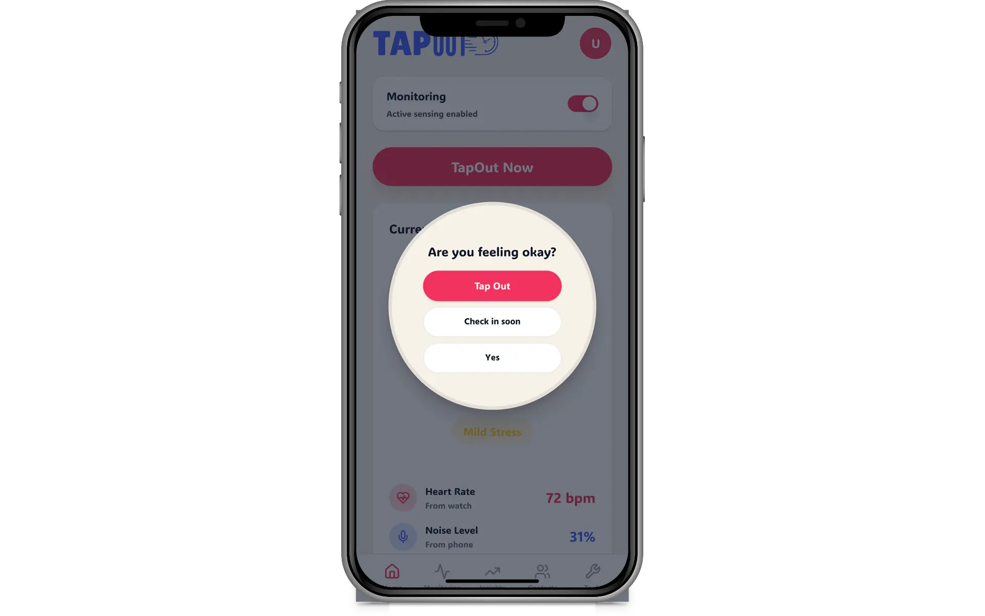
Three options. TapOut: triggers a call. Check in later: receive a notification again in 15 minutes (unless user is no longer overwhelmed). I'm Okay: no more notifications.
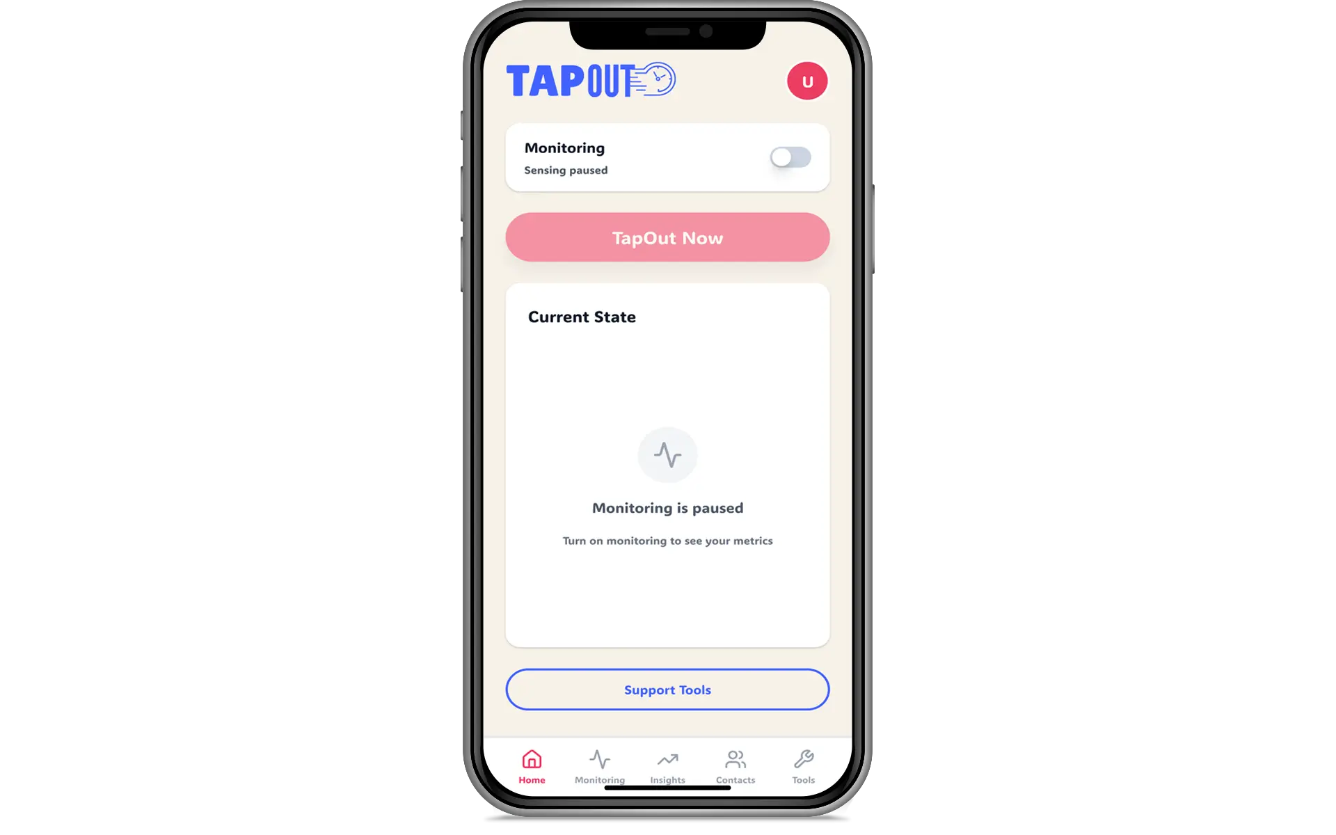
To protect privacy, users can turn off monitoring at anytime, in a single click at the top of the home screen.
05 | Iteration
The most important improvement made the app less insistent.
ORIGINAL IDEA
Detect a threshold, send a check-in, and offer only two answers: “I’m okay” or “TapOut.”
WHAT WE LEARNED
The alert itself could contribute to overload. The binary choice also ignored the person who needed support but did not want to leave yet.
WHAT CHANGED
I added a 15-minute “Check in later” option, clarified dismissal behavior, and kept a direct, manual route to TapOut whenever someone needs it.
What changed in the interaction flow
The first concept overestimated what the sensing system could know and underestimated how much a notification might disrupt someone. Our early feedback made that clear.
The revised check-in has a clear hierarchy: the person can dismiss, postpone, or act. The monitoring controls are visible, the system does not continue prompting just because its estimate disagrees, and exit support can be reached manually.
This remains a prototype. The next iteration would need to test how often to check in, whether the wording feels respectful, and how the experience works when the user is not looking at their phone.
06 | Final Experience
Notice. Check in. Choose what happens next.
The finished prototype brings the concept into a short, understandable path. A home view shows monitoring status, live or simulated signal information, and quick access to help. Context settings let someone adjust sensitivity. A discreet check-in presents meaningful responses, while TapOut opens optional exit support.
These are prototype interfaces and explorations, not proof that wearable devices can reliably determine a person’s emotional state.
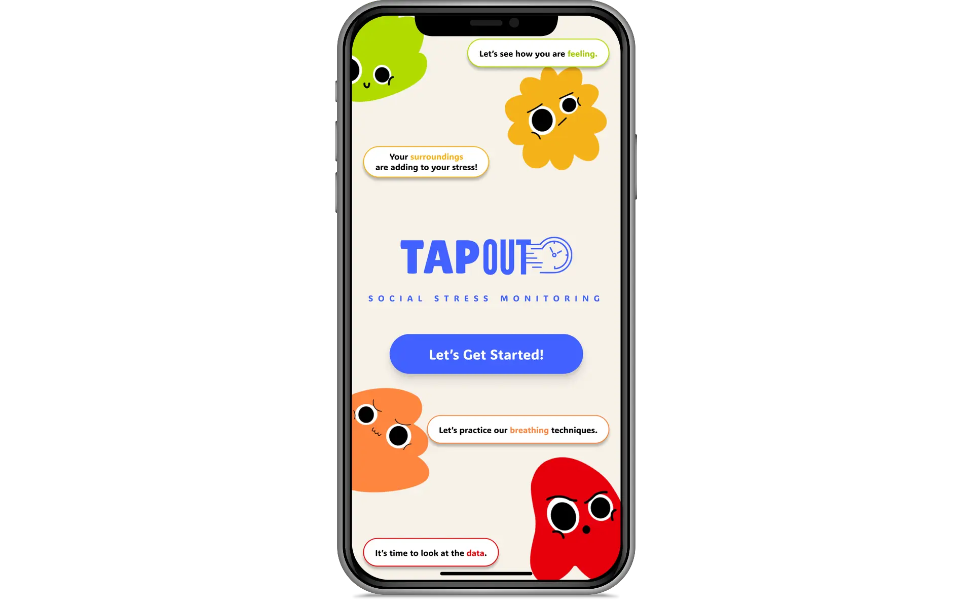
Fun, inviting welcome screen.
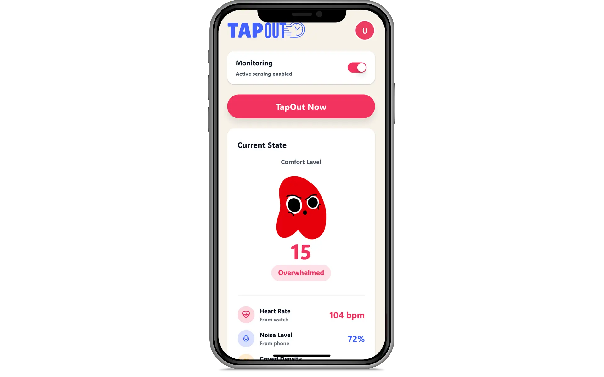
TapOut home screen, showing user in overwhelmed state.

User can initiate a Tapout from a button on the home screen. They do not need to wait for a notification.
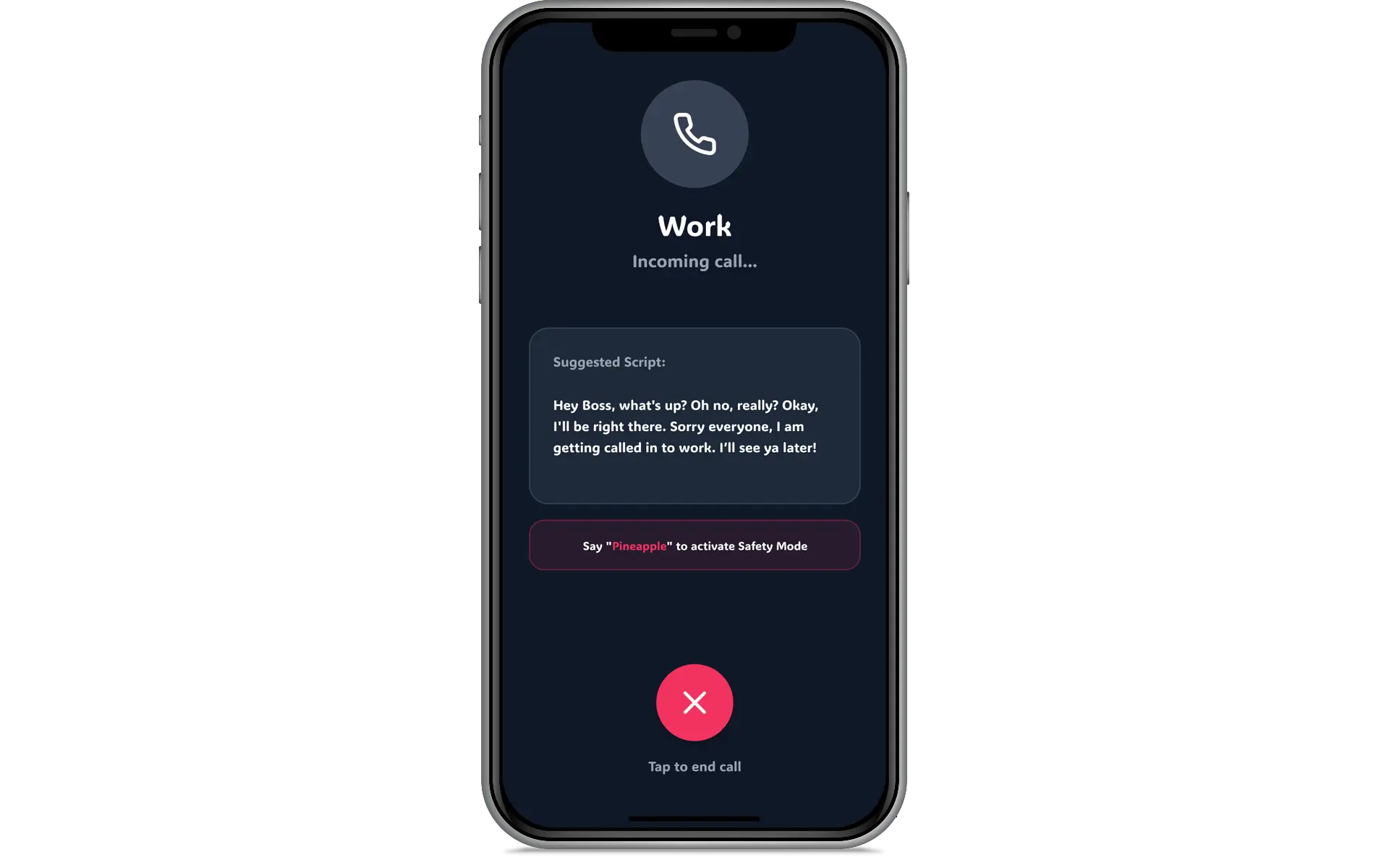
Example of a phone call from TapOut.
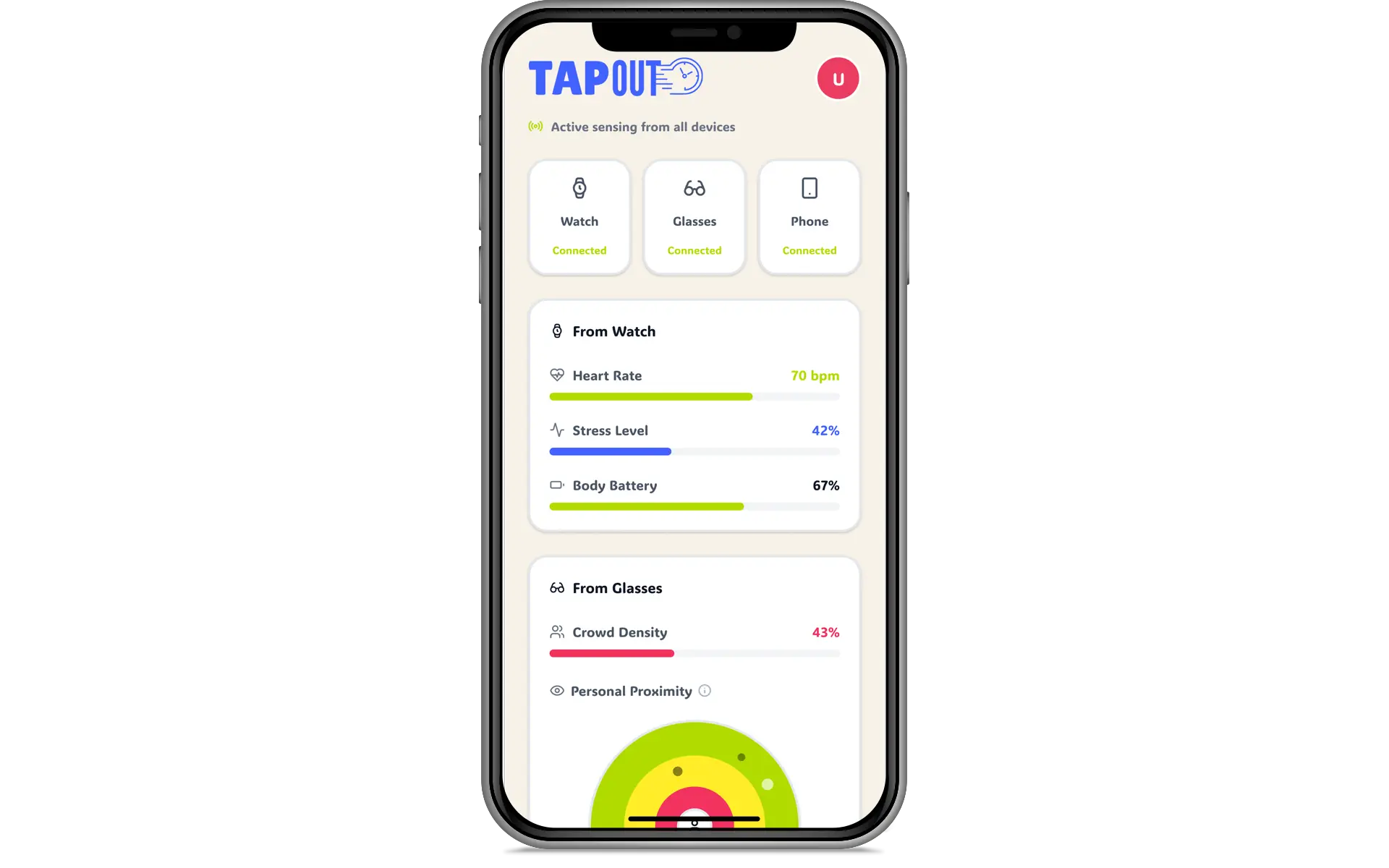
Metrics screen. User can turn on and off monitoring from various devices, and see their metrics if they want to.
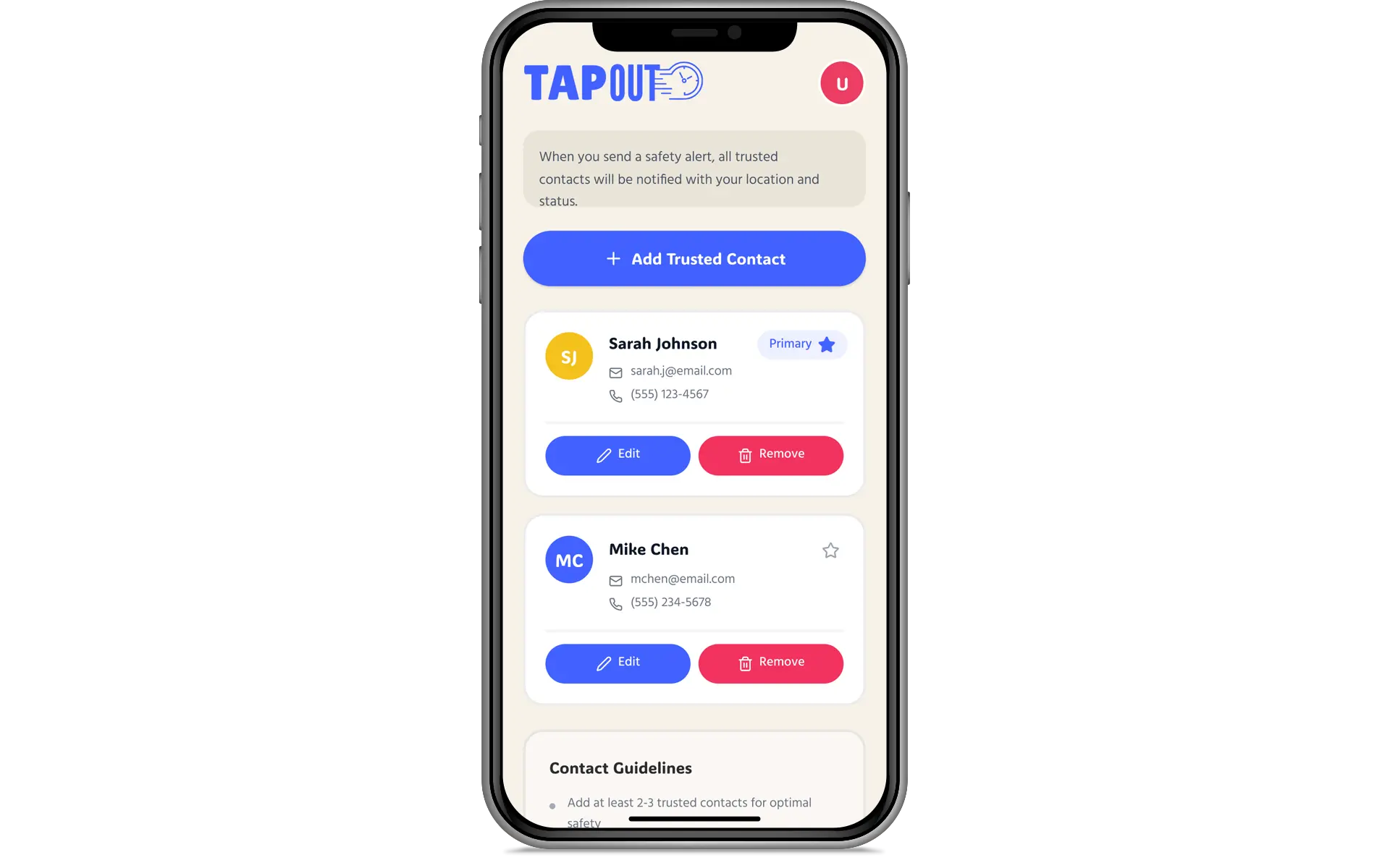
Contact screen where user can add, edit, and delete trusted contacts.

Tools is where the user can go to get practical help in a situation where they may not be able to leave.
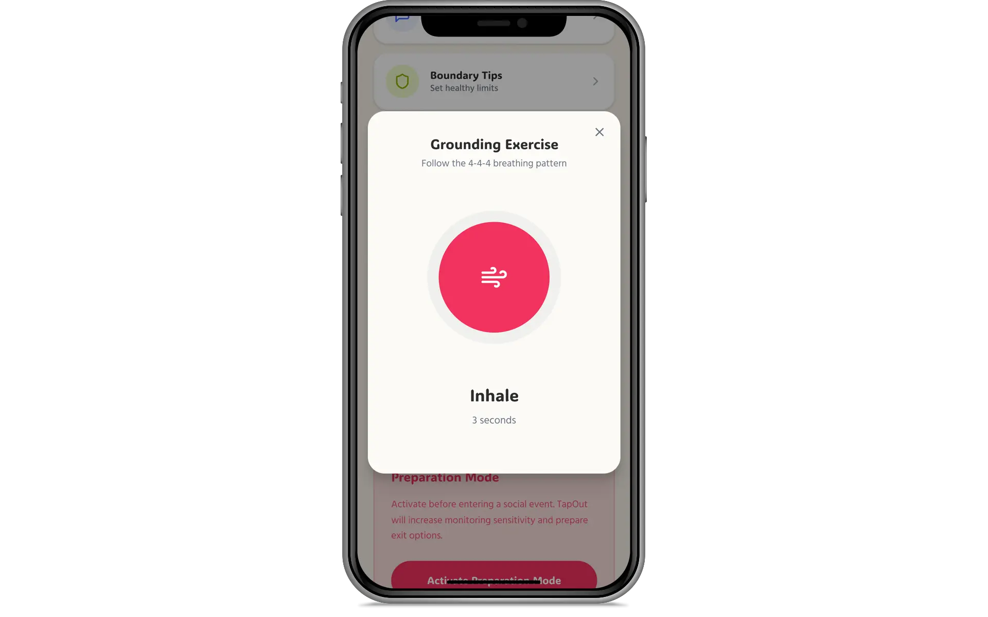
TapOut breathing exercise, from tools.
What changed in the interaction flow
The first concept overestimated what the sensing system could know and underestimated how much a notification might disrupt someone. Our early feedback made that clear.
The revised check-in has a clear hierarchy: the person can dismiss, postpone, or act. The monitoring controls are visible, the system does not continue prompting just because its estimate disagrees, and exit support can be reached manually.
This remains a prototype. The next iteration would need to test how often to check in, whether the wording feels respectful, and how the experience works when the user is not looking at their phone.
07 | Outcome
The feedback changed the interaction, not just the visuals.
16
early research responses
15 min
recheck option added
Sixteen responses gave us useful early feedback on TapOut’s concept and usability. The clearest improvement was a redesign of the check-in flow: instead of forcing someone to dismiss or leave, the revised prototype offers a respectful way to wait and reconsider.
That is a design outcome, not evidence that TapOut can detect overwhelm accurately or prevent harm. We did not measure real-world stress reduction or validate the underlying sensors. The next step would be broader usability research and feasibility work with the people and devices the product is intended to support.
What changed in the interaction flow
The first concept overestimated what the sensing system could know and underestimated how much a notification might disrupt someone. Our early feedback made that clear.
The revised check-in has a clear hierarchy: the person can dismiss, postpone, or act. The monitoring controls are visible, the system does not continue prompting just because its estimate disagrees, and exit support can be reached manually.
This remains a prototype. The next iteration would need to test how often to check in, whether the wording feels respectful, and how the experience works when the user is not looking at their phone.
08 | Reflection
Less automation. More autonomy.
I went into FigBuild excited by what connected devices might notice. I came out caring much more about what the app should not assume.
TapOut became stronger when I stopped designing around the system’s confidence and started designing around the person’s choices. The 15-minute option is small, but it solved a real interaction problem: someone can acknowledge a difficult moment without being forced to declare they are fine or ready to leave. The best change was not adding another clever sensor. It was giving the person more control.
I still like the ambition of the concept. I just think that ambition needs to be matched with privacy, humility, and the willingness to let a person disagree with the technology.
NEXT QUESTION
Test with a broader and more diverse group in realistic settings. Study notification fatigue, manual access, false positives, control language, privacy expectations, sensing feasibility, and the failure states of any trusted-contact feature before considering real-world deployment.